The Challenge We Tackled Together
Mailerbot had a simple idea that’s surprisingly hard to pull off: sending a real postcard or letter should feel as easy as sending an email. The product was already powerful, letting businesses design, personalize and mail thousands of pieces at once. But it was a brand-new company with no identity, no personality and no story yet. The challenge? Building a brand that made something technical and automated feel friendly, even a little fun, while still showing it could handle real volume.
How We Made It Happen
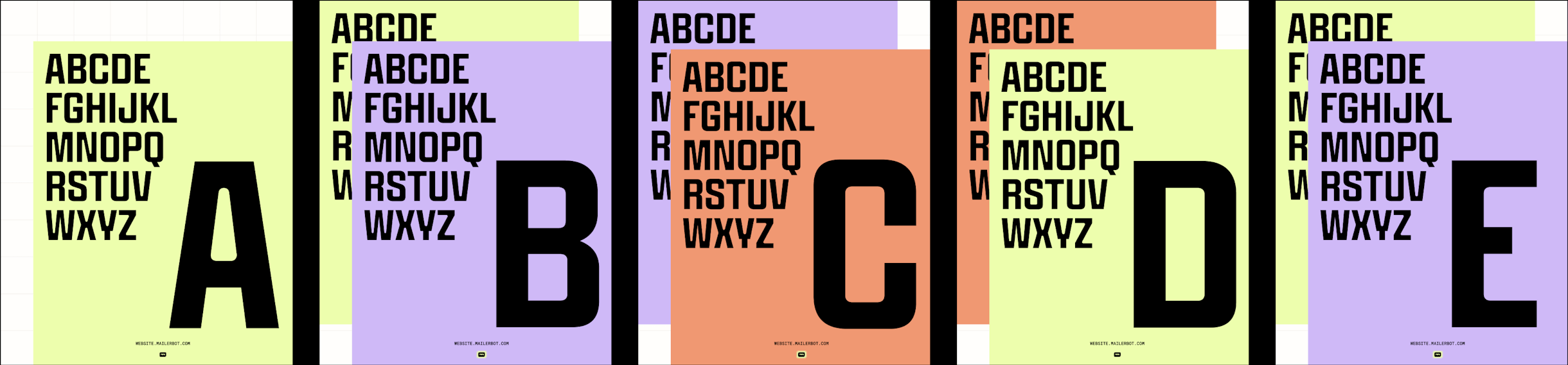
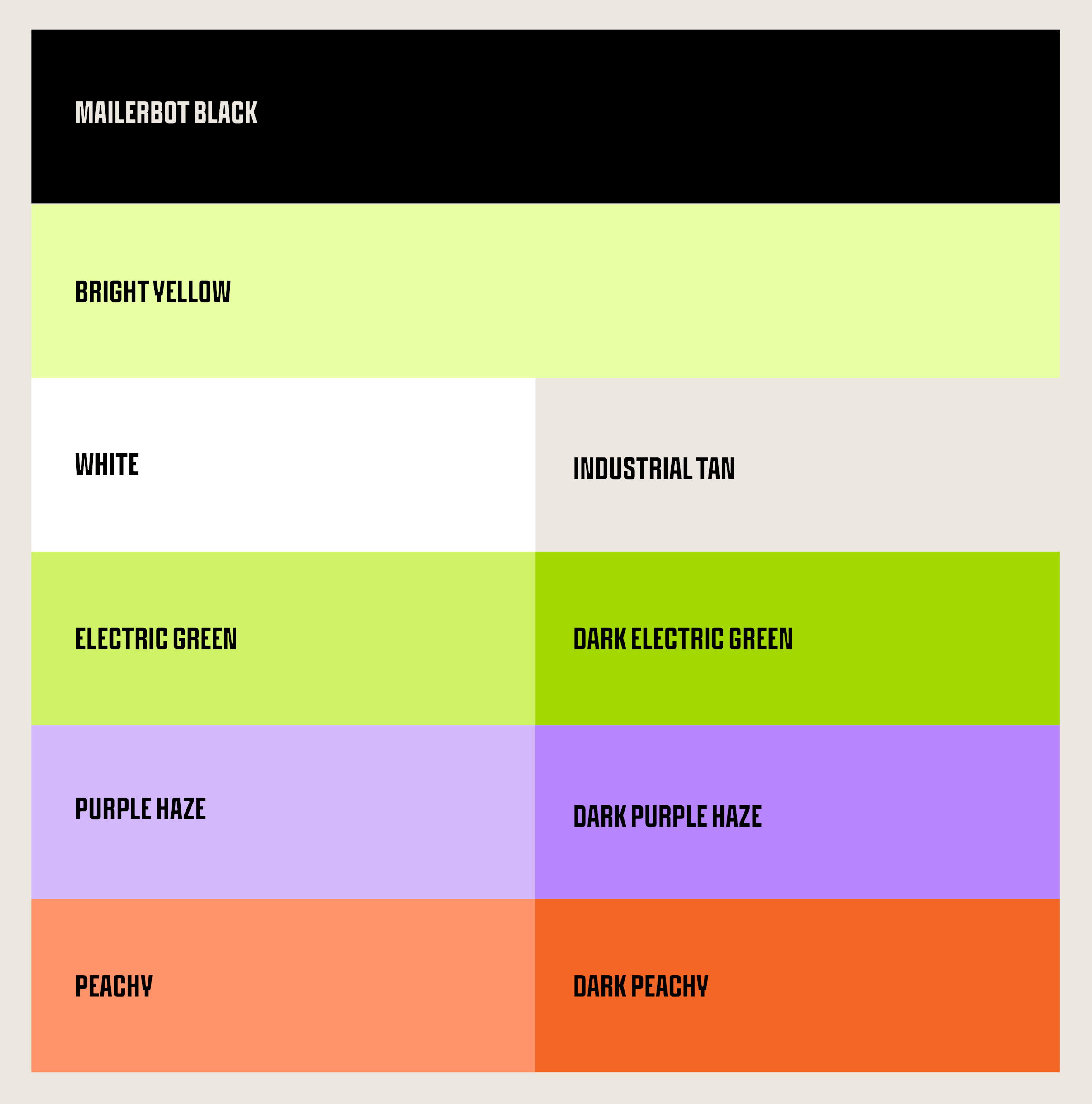
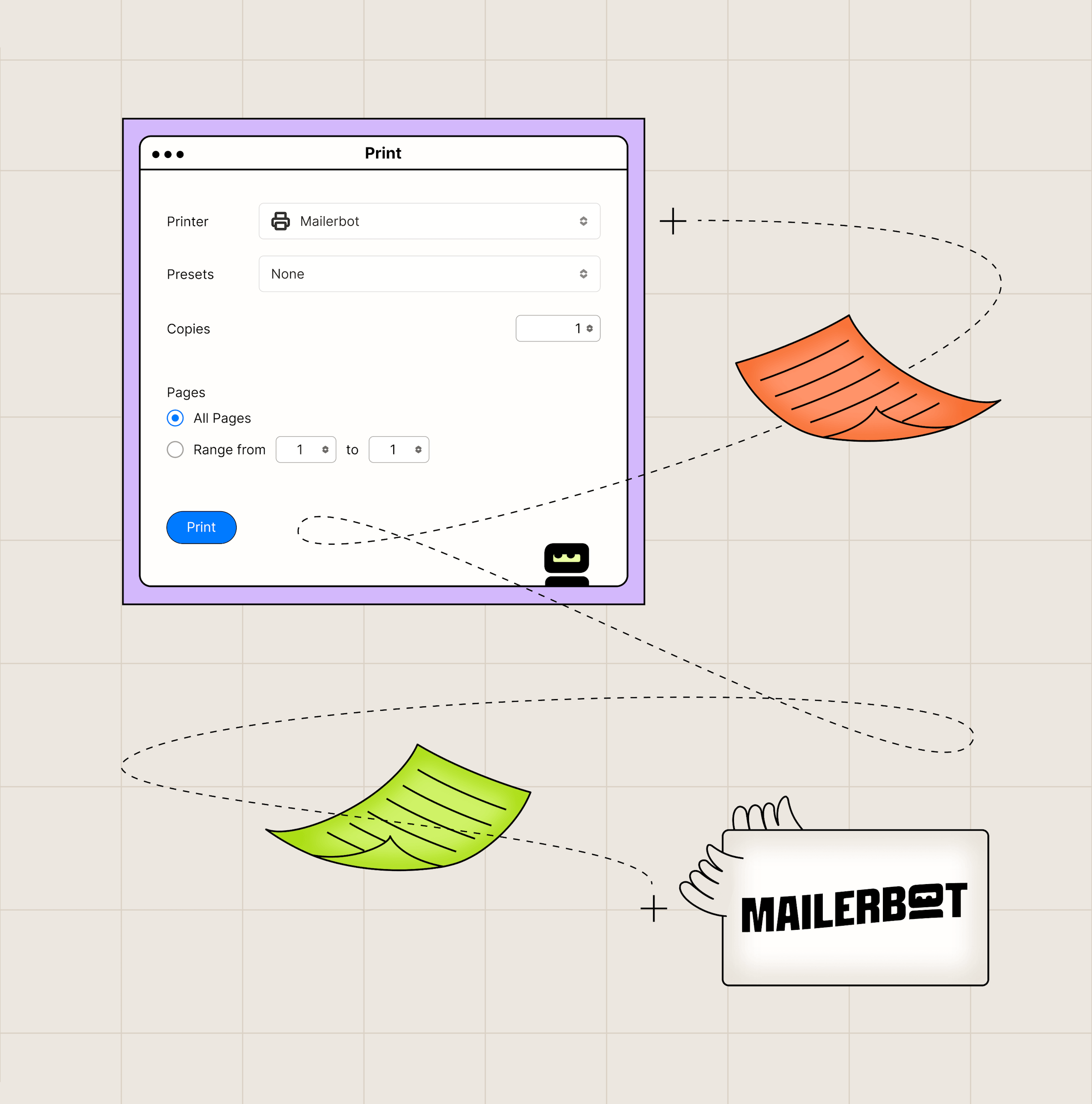
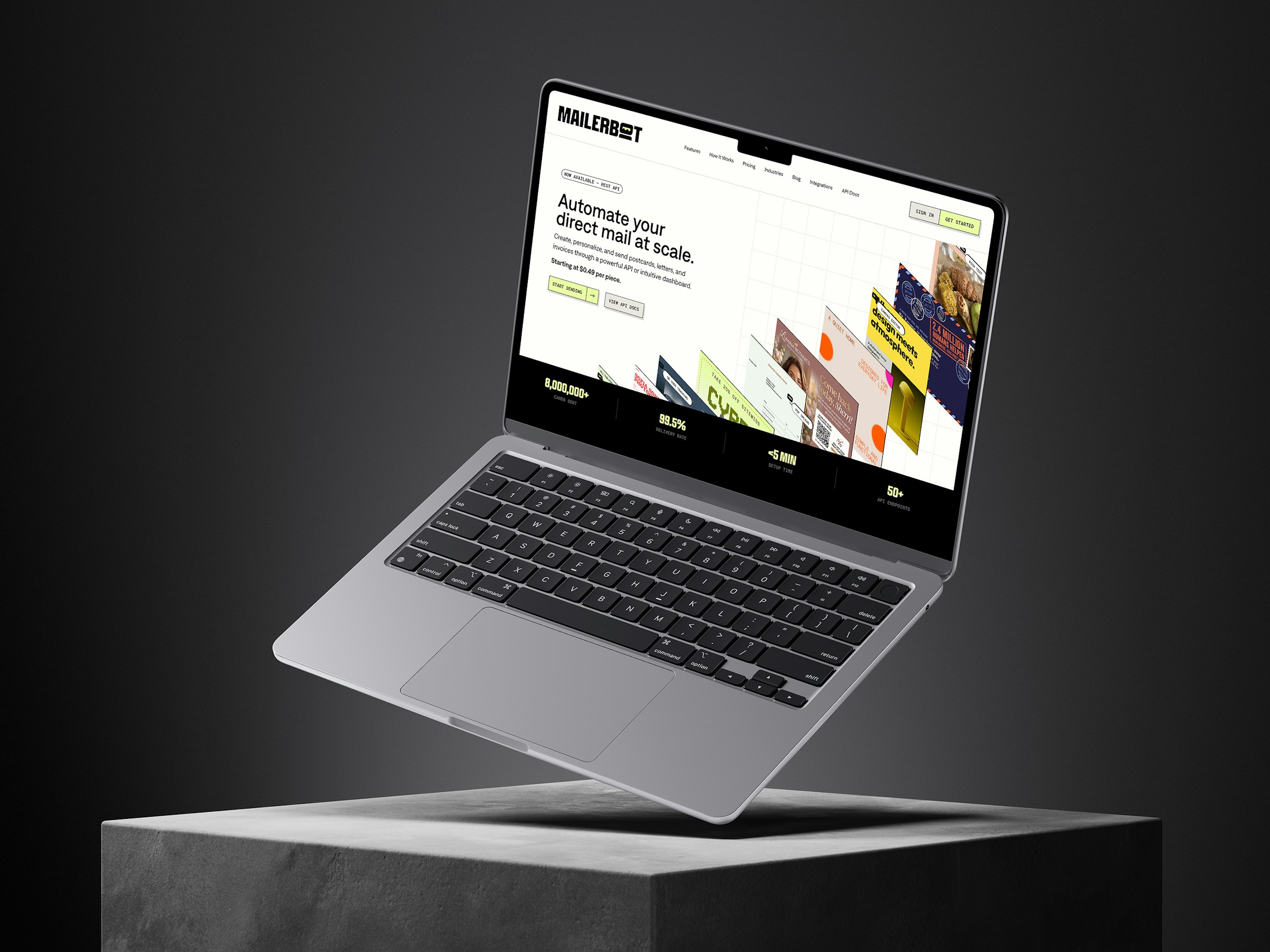
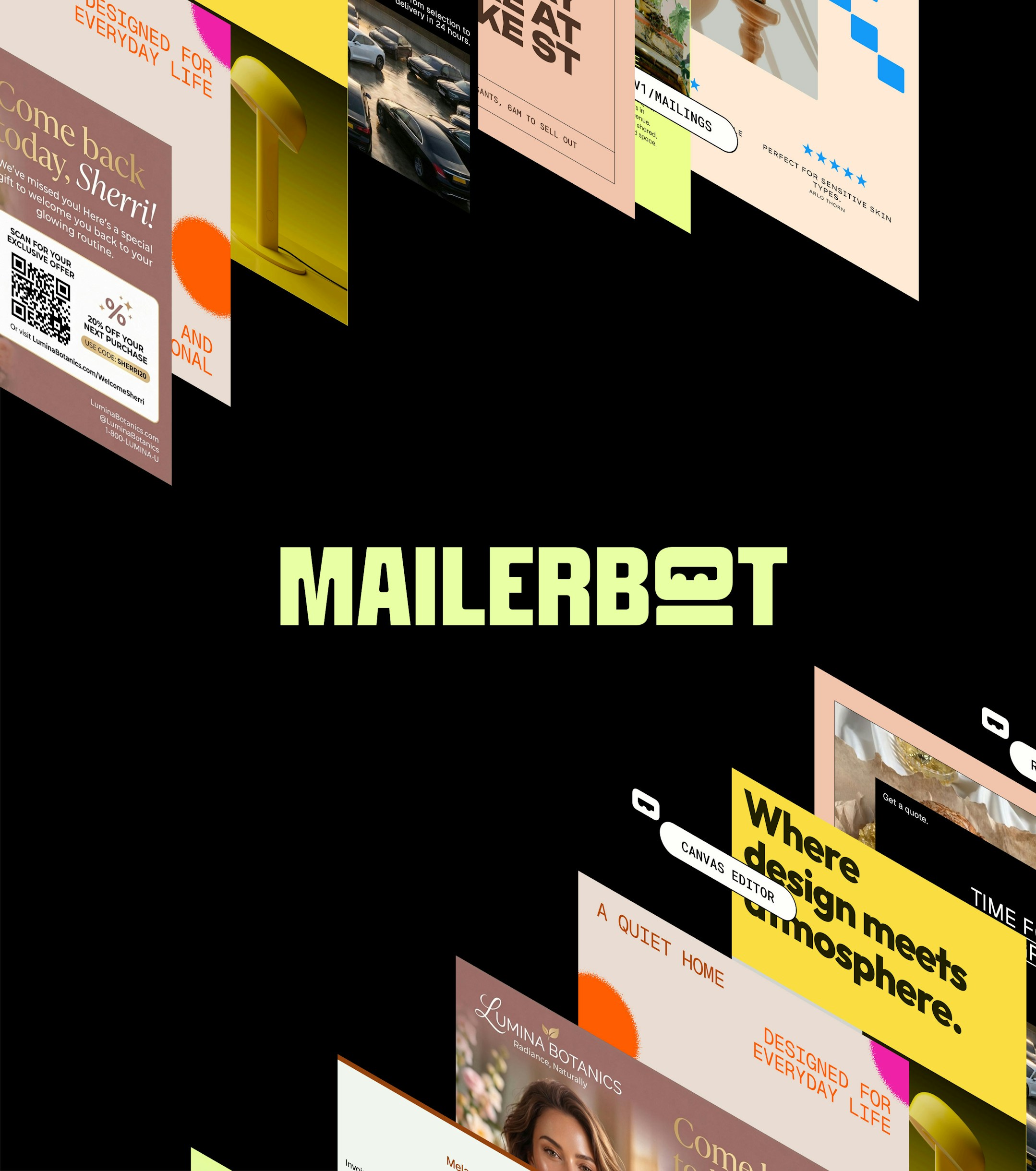
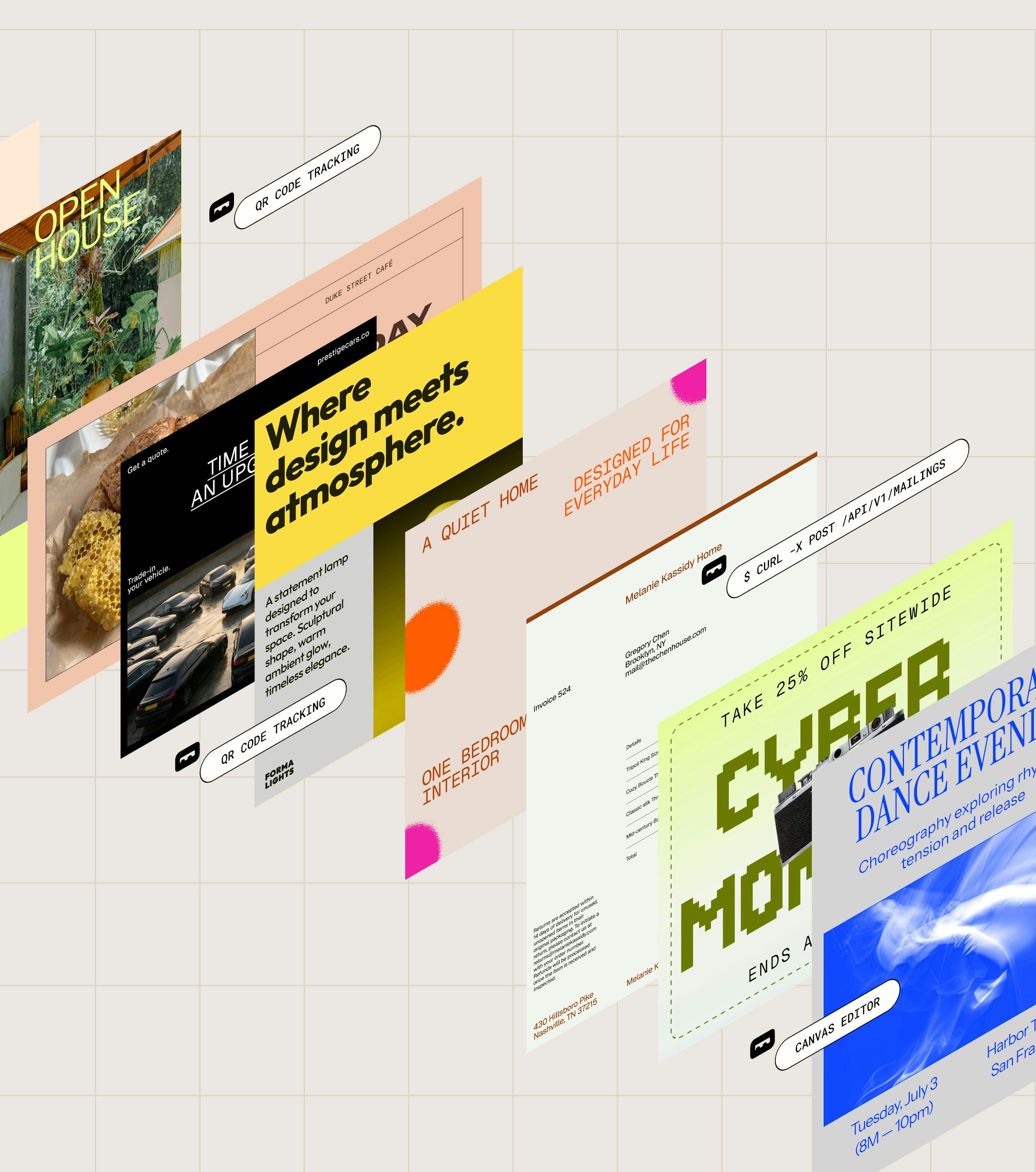
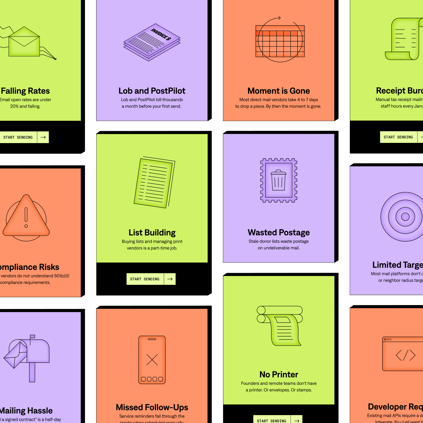
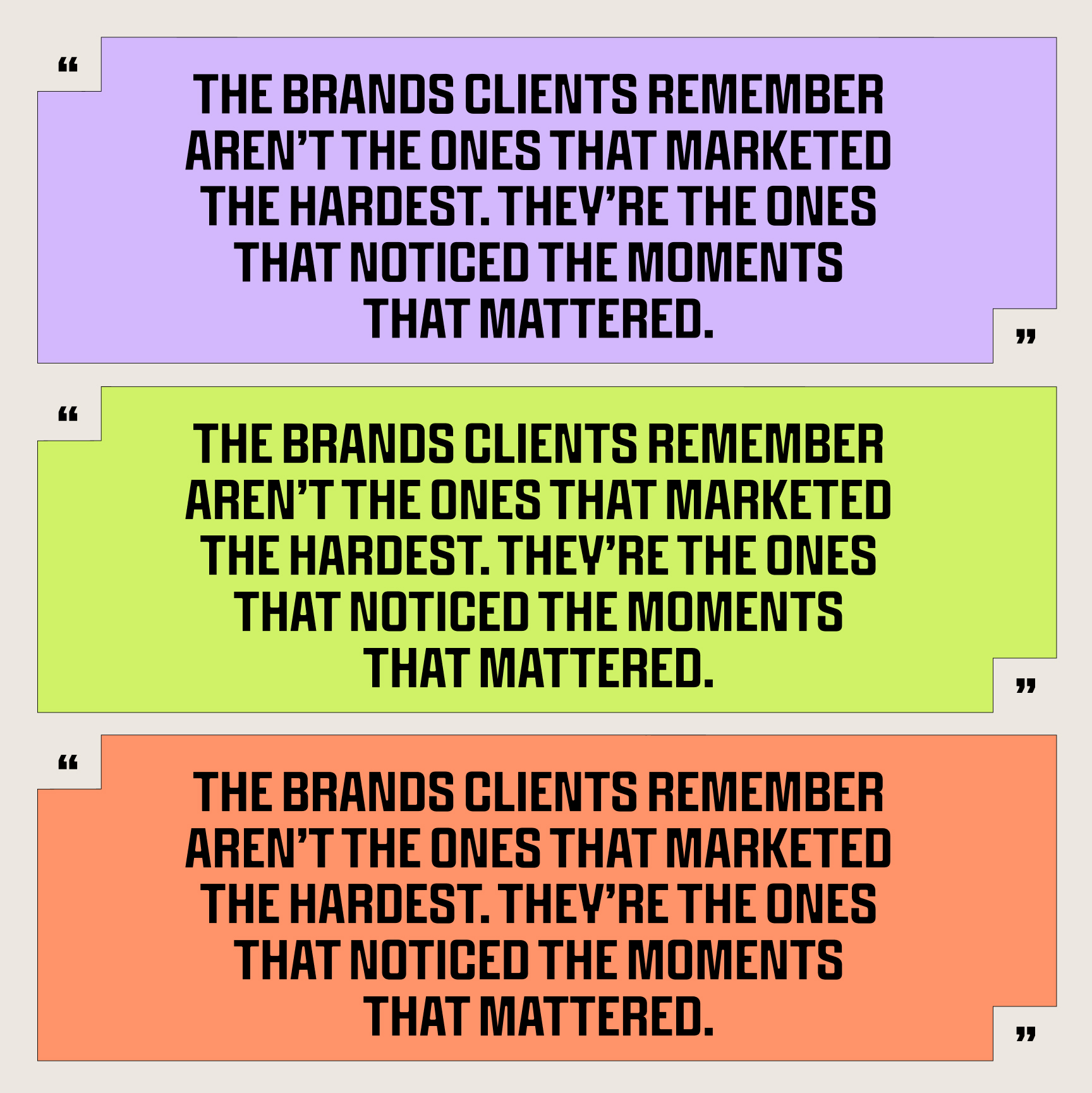
We started with the bot. If a robot is going to handle your mail, people should like it, so we gave the wordmark a little face and let that personality lead everything else. From there the brand got louder in the best way, with chunky condensed type, bright yellows and electric greens, lilac and coral, held together by a clean black and a warm industrial tan. We carried that character into every touchpoint. Mail flies across the page, print dialogs pop up where you’d least expect them, and a quiet grid keeps it all feeling precise. By the time it reached the website, the brand was doing the talking, and developers and marketers alike could get it right away and smile a little on the way to hitting send.
What We Achieved Together
Mailerbot now stands out as the friendliest name in a category full of gray, utilitarian software. Direct mail automation can sound dry on paper, but the brand makes it approachable and memorable, and it turns a complex product into a story anyone can follow. They launched with a complete identity and a brand experience built to grow with them.